Resources
The Why of It
When I started my journey into working with colored slips, I found very little solid reference to guide me in my first steps. Most of what little I could find to read was vague and noncommittal. The common theme was, "Here's lots of info on using stains to color your glazes. You can also use them to color slips and clay bodies, but that requires lots of testing. Moving on..." I found this constant avoidance infuriating, and was very nearly discouraged. I'd seen finished works by potters using colored slips, and there were hundreds of books out there about surface decoration that included the use of slip. These books were largely written by potters, but their literary lips were sealed as far as the specific slip colorant percentages.
Part of me now understands why. Working with colored slips takes an enormous amount of trial and error. The bulk of this work is on the very front end of the adventure, when you have to figure out what percentages of which colorants to use to achieve the color palette you want. Over time you revisit this stage to refresh your visual rainbow, but that first slog is brutal. After so many weeks, months, firings, dollars, blood, sweat, and frustrated tears invested, this hard-won knowledge is something we feel must be guarded and kept secret. After all, we worked so hard to just get these few colors, why should somebody else get to pick up and run with it, without having to put in the work? That's not fair!
... isn't it?
We all have built our clay knowledge on the hard-won lessons of thousands of potters before us. From the moment the first human hand touched the first lump of fresh-dug clay, the chain of knowledge has been passed down for hundreds of generations of ceramicists. We are all the beneficiaries of the many who have come before us, who suffered that slog to achieve every little facet of our craft. From the tools to the techniques, everything we have learned was learned a first time by someone else, and passed on to us tested, tried, and proven.
For this reason, I have decided to share what I have gleaned from my experiments, in honor of those who came before me, for any who want a place to start. My work is not expansive, my recipes are not perfect, but I will share what I know so that others may build on it. In this way the craft can move forward rather than stagnate in our hard-won and well-kept secrets.
Baseline
All of my surface slips are made from a cone 5/6 white porcelaneous stoneware slipcasting body made by my friend and coworker Melanie of M Schopper Ceramics. Now most established ceramic literature will tell you not to use casting slips as decorating slips, but I've not had a problem with it yet. Sometimes a thing just works and you have to roll with it. Anyway, as this is not my slip formula, I cannot share it, but the basics of it being a cone 5/6 white porcelaneous stoneware body should be enough to help you choose a similar recipe.
Since I get the slip pre-made, my percentages are based on estimations of dry-to-wet ratios. I won't bore you with the math, but basically, we figured that about 5.67 grams of dry Mason Stain per pint of slip equals about 1%. This is calculated as an additive to the base 100 recipe for the slip. So the plain slip formula ratios add up to 100, and then the mason stain is an addition to that. The slip is typically a runny-melted-ice-cream consistency, and is very thixotropic.
5.67g / pint = 1% saturation
Now, keep in mind, that these are rough measurements, not exact. I'll include gram amounts with each tile so you know how much dry stain I used in how much wet slip.
For those of you poor bastards without a scale, here's a little trick to help you get started. If you're like me, you buy your stains in 1/4 lb packages from the local supply shop. Assuming your slip is similar to mine, here's how you can very roughly guesstimate how much dry stain you are adding:
Take that 1/4 lb packet and dump it out onto a clean, dry surface. Pile it neatly.
If you were to take half of that pile (1/8th lb) and mix it into your pint of plain slip, you would have approximately 10% saturation.
Now you have only half of the original pile left. Cut that remaining portion in half (1/16th lb), and add that to a separate pint of plain slip. This mixture would have approximately 5% saturation.
You can continue along these lines to get smaller percentages, or cut the pile in different ways to allow for other rough percentages.
Now, in a perfect scenario, you would be mixing your own slip and be able to get exact gram weights to make your percentages precise. However, I'm not that picky about the EXACT shade of light salmon pink that I get, so close enough is good enough for me. So below are my results using my above-explained method of 5.67g dry stain / pint liquid slip = 1%.
A NOTE ON MIXING: Mason stains do not dissolve in water, but they can be suspended in it. For this reason, it is VERY important if you are adding dry stain to wet slip, to suspend the stain in water first before adding it to your slip. Use as little water as possible to do this, as you don't want to thin your slip out too much. This is why I prefer having a thicker base slip to start with. once I add the stained water, it makes the slip just the right consistency. If you try to just dump in mason stain dry into your slip, you will find lots of little clumps of stain when you fire, and any clear glaze you put over top will likely crawl away from these concentrated points of oxide. So dilute in water FIRST, then add to your slip, and mix WELL! I use a kitchen hand-mixer and spend about 5 minutes blending each pint of color.
If you are adding stain to dry mix, you should have an easier time of it.
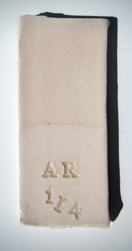
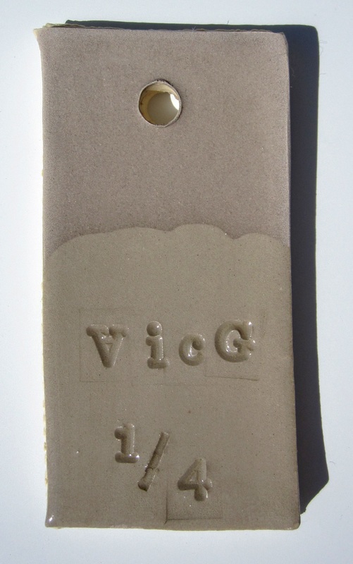
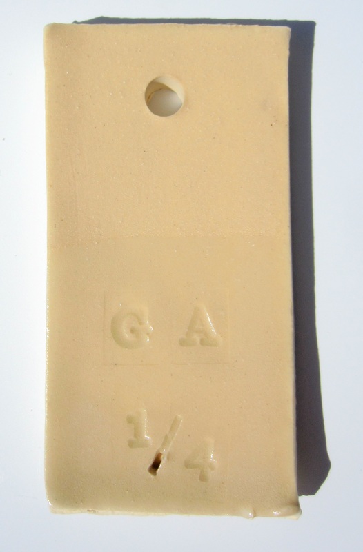
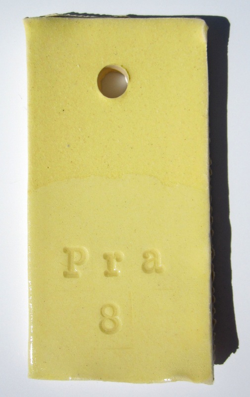
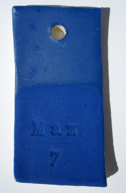
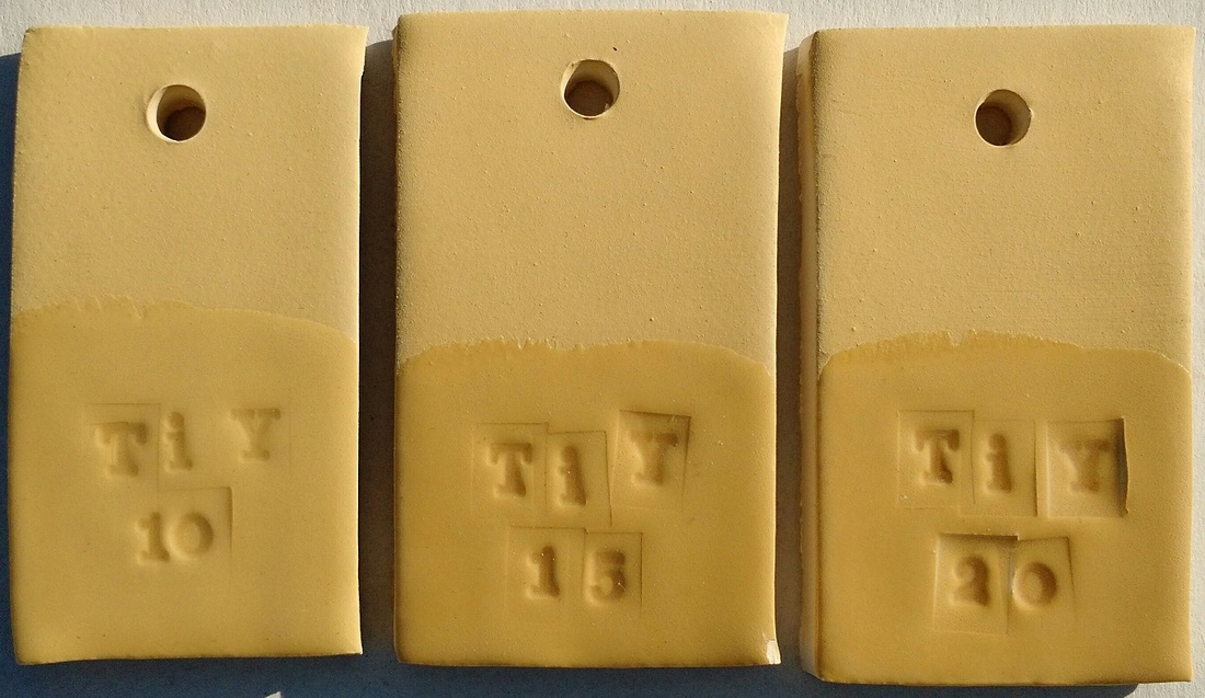
The following results are very narrowed down to give you the most useful information without uploading a million photos of tiles. Bottom half of each tile is coated in clear glaze.
Alpine Rose
|
Victoria Green
|
Golden Ambrosia
|
Praseodymium
|
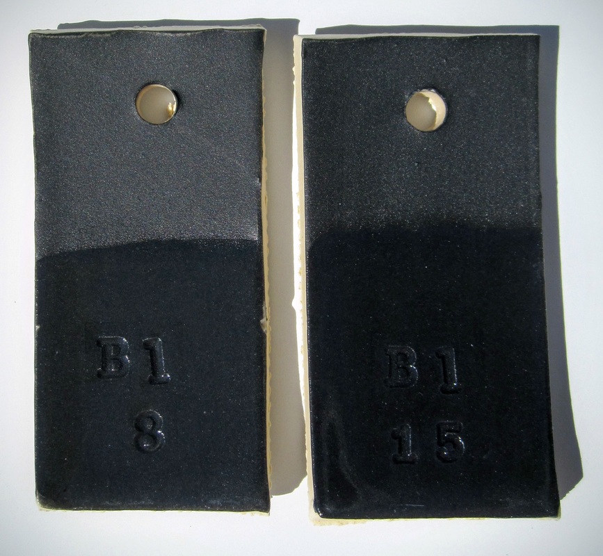
Black
|
|
22.4g
1 pint slip 4% |
42g
1 pint slip 7.5% |
Notes: Higher percentage gives a deeper black. Other sources give 30% as the best saturation for a deep black, however I've gotten nice results with the 7.5% mix.
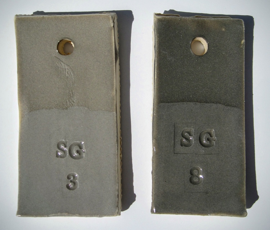
Sage Gray
#6500
|
8.5g
1 pint slip 1.5% |
22.4g
1 pint slip 4% |
Notes: Provides a warm gray. 8% gives a nice charcoal, 3% is a light dove gray.
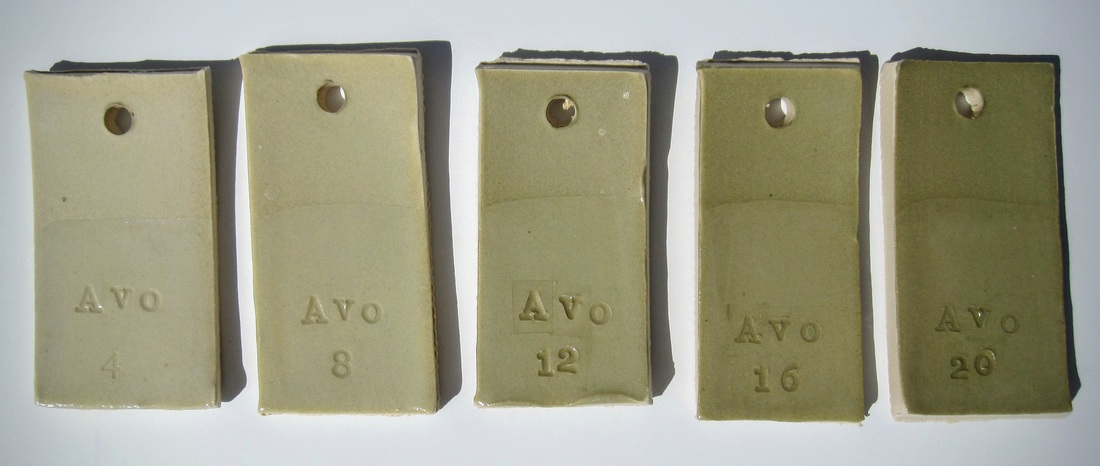
Avocado
#6280
Per 1 pint of slip:
11.2g - 22.4g - 33.6g - 44.8g - 56g
Notes: Color is barely noticeable until #16, #20 is a light mossy green. Higher saturation tests needed.
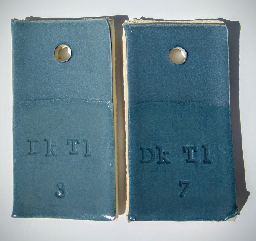
Dark Teal
|
|
8.5g
1 pint slip 1.5% |
19.6g
1 pint slip 3.5% |
Notes: 3-4% seems to be ideal for richest color.
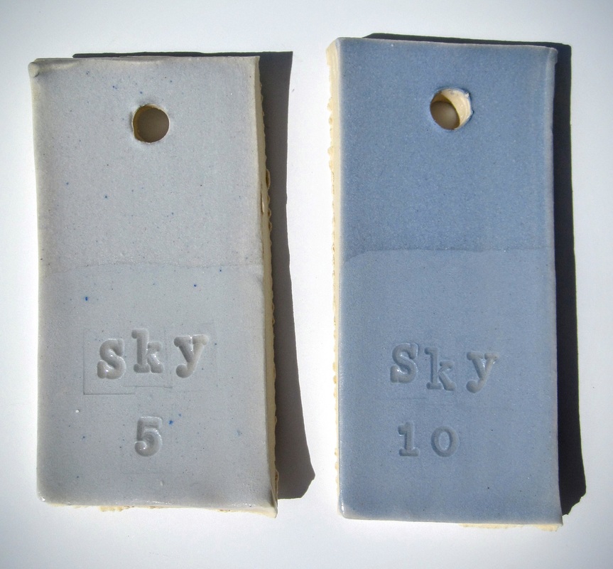
Sky Blue
#6363
|
14g
1 pint slip 2.5% |
28g
1 pint slip 5% |
Notes: You can see the result of adding dry stain to wet slip on the left tile. Pockets of unsuspended colorant pop out after firing. 2.5% is a very pale blue, 5% is a rich baby blue.
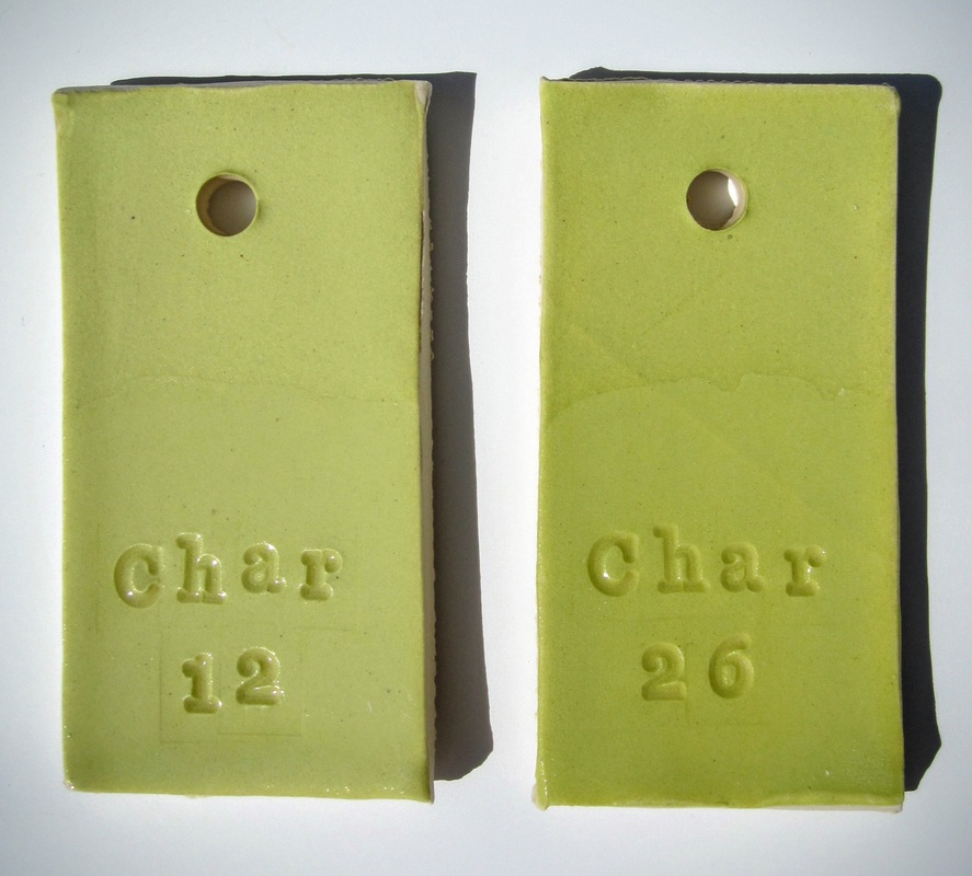
Chartreuse
|
|
33.6g
1 pint slip 6% |
72.8g
1 pint slip 13% |
Notes: 6% is a nice mint green, 13% gives a true vivid chartreuse color. My new favorite!
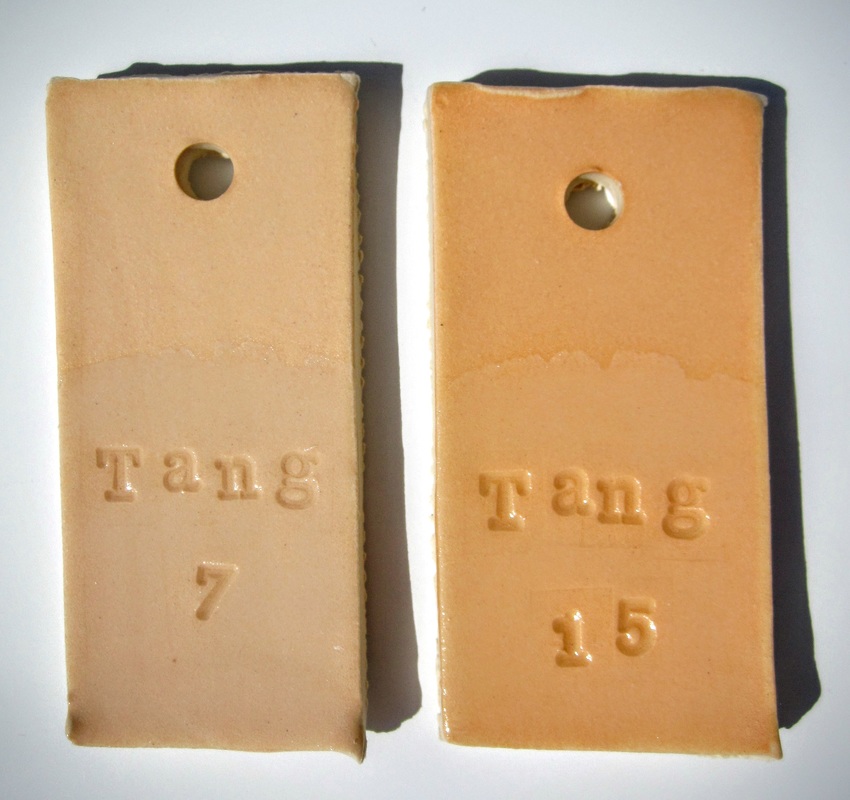
Tangerine
#6027
|
19.6g
1 pint slip 3.5% |
42g
1 pint slip 7.5% |
Notes: 3.5% is a pastel salmon pink, 7.5% looks like cooked salmon! Looks nice with Chartreuse. Higher percentages may yield a more orange result.
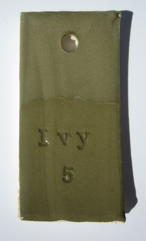
Ivy Green
|
Mazerine Blue
|
Titanium Yellow
|
|
28g
1 pint slip 5% |
|
Notes: Very little color variation between the percentages. 7.5% is slightly more pastel than the bright goldenrod of the 10%. This is an inexpensive color, so higher saturation tests are feasible and might yield brighter results, but I will be sticking with the 10% for a while.
